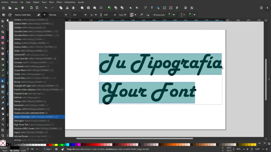
In the world of web development, selecting the right typography plays a crucial role in the aesthetics and readability of your WordPress site. At HC-Meta Web Developer, we understand the importance of choosing fonts that convey your brand identity and enhance user experience. In this article, we’ll explore practical tips for selecting the best typography that complements the aesthetics and functionality of your WordPress site.
1. Consistency and Cohesion
Maintaining consistency and cohesion in typography is essential for your website. Choose a primary font for headings and another for body text, and keep this selection consistent across all pages. Consistent typography helps establish a strong visual identity and facilitates readability for visitors.
Key Questions:
- What message do I want to convey with my typography?
- How can I maintain consistency in typography across all pages of my site?
2. Legibility and Clarity
Prioritize legibility and clarity when selecting fonts for your WordPress site. Avoid overly elaborate or difficult-to-read fonts, especially for body text. Opt for fonts with good contrast and appropriate size to ensure a comfortable reading experience for your users.
Key Questions:
- Which fonts are most legible at different sizes and on various devices?
- How can I enhance text clarity through the use of appropriate fonts?
3. Font Pairing
Experiment with font pairings to add visual interest and information hierarchy to your site. Combine a serif font with a sans-serif font to create contrast, or choose fonts from the same family with different weights to highlight important elements. Maintain a balance between variety and cohesion in your typographic choices.
Key Questions:
- Which font combinations will complement my brand identity?
- How can I use different fonts to differentiate headings, paragraphs, and navigation elements?
4. Consider Scalability and Accessibility
Consider scalability and accessibility when choosing fonts for your WordPress site. Ensure that the selected fonts are legible on different devices and screen sizes, including mobile devices. Additionally, consider accessibility for users with visual impairments by opting for fonts that are easy to read and comply with web accessibility standards.
Key Questions:
- How will the fonts appear on mobile devices and screens of different sizes?
- Which fonts meet web accessibility standards to ensure an inclusive experience for all users?
5. Testing and Feedback
Finally, test different fonts and solicit feedback to find the perfect combination for your WordPress site. Conduct usability tests to evaluate the legibility and visual impact of fonts in different contexts. Adjust as necessary and continue refining your typographic choice to enhance the user experience.
Conclusion
Choosing the best typography for your WordPress site is an essential part of the design process that can influence the perception and usability of your site. By following these tips and considerations, you can create a visually appealing and user-friendly experience that reflects your brand identity and delights your users. At HC-Meta Web Developer, we’re here to help you select the perfect fonts that will take your WordPress site to the next level.
We are here to help You.
Please, fill out the following information and we will gladly contact you as soon as possible.


